The audience that I am gearing this poster toward is for the student, specifically a student in a STEM related field. Stevenson has driven its university focus toward one that is career-oriented, leaving me to have my suggestions pertaining to neatness and structural order of a particular work. The STEM field tends to lead away from abstract designs or ideas, thus, making the need for the Greenspring Review to be visually pleasing and organized. Many students attend Stevenson for this reason, leaving me to believe the audience to be more willing to adhere to logic and order rather than abstract and artistic. As reflected in my poster, there is a systemic theme occurring throughout, leaving an importance to theme and least effort usability principles all with the goal of catering toward Stevenson students.
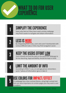
For the poster itself, my focus was on alleviating the user experience as much as possible. Having a consistent layout allows the user to be able to use the website faster as it most likely relates to other websites that the user is already familiar with, reinforcing a well known Gesalt psychology found in Jakob’s Law. In terms of the colors and font use, I used red font on key words in the “Do” poster to draw more impact on the specific word. Cool colors are usually read as calming and are used to create less emphasis than warm colors (Ball). Presenting the information in a step-by-step infographic allows for the user to consume the information with more efficiency and less effort, reinforcing Hick’s Law where less is more. These are among many of the items that I feel should be necessary in catering the Greenspring Review to the audience of Stevenson students. (Livesession)
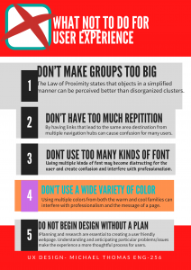
The choices aesthetically for this poster were used to provide information in a way that is appealing to students of this background. We as humans naturally view the colors green and red as stop and go (or good and bad), so by having posters with certain colors provide the reader with a better visual aid for understanding and making certain information “pop.” Having the information in a sequential order (1, 2, 3, 4, 5) provides a clear and concise way of providing ways to improve user experience and things to be cautious of. In the “Do” poster, I maintained a consistent format with a headline and a brief description using some color font to make key aspect hit home. In the “dont” poster however, I made the boxes slightly uneven and used random colors. What this does is create disorganization and if a website’s information is hard to read or doesn’t answer users’ key questions, then users will leave (Usability 101)
7 Psychological Principles for Better UX.” LiveSession, https://livesession.io/blog/7-psychological-principles-for-better-ux. Accessed 18 Feb. 2020.
Ball, Cheryl E., et al. Writer/Designer: A Guide to Making Multimodal Projects. “Chapter 1: What Are Multimodal Projects?” Second Edition. Bedford/St. Martin’s, 2018. Print.
World Leaders in Research-Based User Experience. “Usability 101: Introduction to Usability.” Nielsen Norman Group, www.nngroup.com/articles/usability-101-introduction-to-usability/.