The audience for the poster is people suffering from depression. The idea of the poster is to provide a pleasing, easy, readable site and set of guidelines for developers hoping to appeal to those suffering with depression. As someone who suffers daily with depression, I chose the suggestions both from research and from my own personal experience. When someone suffers from depression, they can experience symptoms such as “persistent sad, anxious, or empty mood; difficulty concentrating, remembering, or making decisions, and feeling restless or having trouble staying still” among many others. With these symptoms in mind the design had to include features that someone with depression could utilize and find that they made using the site easier when their condition was flaring up and not simply when they were feeling okay and happy.
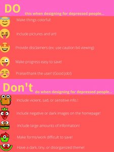
My do’s and don’ts include making things on the poster and the site colorful. I chose this because the idea was to create a positive user experience (User Testing ) for those with depression and if the site were to feature colors that were associated with happiness and joy then this would be a great thing for someone with depression to interact with when feeling low. I also encourage choosing positive images for the site. This means that rather than choosing images that are dark and foreboding, a suggestion that made it on the don’ts side of the list, the designer should choose images with happy and encouraging connotations to them to dissuade negative thoughts or feelings of hopelessness. For if one has too much exposure to negative material when feeling low this may cause the feelings to stay longer or increase. If dark, negative, or sensitive items must be included on the site, which I strongly suggest avoiding, then a disclaimer should be provided so that if the depressed individual is viewing the site then they can prepare to view said images. This may include waiting and coming back to the images when they are in a better state of mind. I also encourage the designer to avoid displaying large chunks of information on the site. A person suffering from depression may experience an inability to focus (Lyness) and if this is the case then the large portions of information may be overwhelming to them and cause them to shy away from the site. If the site requires portions of information to come in large quantities then I suggest that the User Interface be such that the user can save their progress on the site and come back to it without difficulty (Zaraysky). I also chose to discourage from a tiny, dark, or disorganized them. If the depressed person is taking the time to visit the site when they are not feeling their best then the hope is that the information searched for will be clean, precise, and direct. Lastly, I suggest that the site be encouraging for the user. After all, out of millions of other websites that could have been visited to search the information the user chose this one. That is cause for praise but then to have a depressed individual visit, operate, and get something of the site when they are not feeling well is truly cause for kindness and graciousness.
For my poster I chose a salmon and pink background. These colors were chosen because I found that bright red can cause a person to feel alert and energized while colors such as salmon can cause a person to feel happy (Gremillion). I chose font colors of yellow and white because they were not the norm. Yellow was also found to be a happy color, and since black is seen as a depressing color, I went with white which is considered a calming color. These are all feelings that a depressed person lacks when they are in the middle of an episode/bout of feelings and so if they were to visit the website at that time the hope is that the color choice would soothe them. The decision to put the information in different blocks was to break up the information in hopes that it does not overwhelm the user. The emoji stickers were placed to create some joy, positivity and/or happiness for the user. Instead of using regular mundane bullet points to share my points the emojis do the job while including a design element. Examples were given on the poster when possible, however if I were to include examples of all bullet points it would go against my don’ts list which is something I wanted to avoid. Therefore, on an actual website the design would include these features and the other stylistic elements featured on the poster.
References
Gremillion, Allison. “Colors and emotions: how colors make you feel.” n.d. 99 Designs . Document . 9 March 2020.
Lyness, D’arcy. “Depression .” August 2016. Kids Health from Nemours . Document . 9 March 2020.
User Testing . “UI vs. UX: What’s the difference between user interface and user experience?” 15 October 2018. User Testing. Document. 9 March 2020.
Zaraysky, Sara. “The Obvious UI is Sometimes the Best UI.” 2 October 2019. Google Design . Document . 9 March 2020.