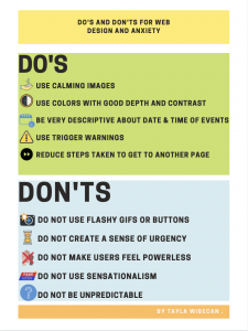
I chose to direct my poster towards people who experience anxiety and how the Green Spring Review can make their website in a way that prevents users from feeling anxious. Anxiety is something that can affect anyone and everyone who may be reading the Greenspring Review. This includes teachers, students, alumni, parents etc. As a designer of the website it is important to ask who the possible users are, and what a designer can do to make their website accessible (Kent 2015).
There are many things that can trigger someone’s anxiety and it is important to know the things you can do to prevent it, and what not to do so you don’t provoke it. The website should have images and videos that are calming and underwhelming along with using colors with good depth and contrast. It is also important to be very descriptive about things such as events in order for the audience to be well prepared. This includes the date, time, location, etc. never leave room for surprises. Always make sure to use trigger warnings for sensitive content such as violence, stress, drugs, loss, etc. And lastly reduce the steps needed to get to another page of the website make navigating through very easy and fluent. A few key things the Green Spring Review should not include in their website are flashy gifs or buttons and do not use things like “Next video will play in 5 seconds” because these could make people feel anxious and antsy. Don’t be unpredictable and make sure the titles of the articles are not misleading or too shocking because this is an easy way to trigger anxiety. And lastly do not make the users feel powerless, or that they are not in control while navigating through the site. This means limiting the amount of popups and ads throughout the website.
I wanted the aesthetic for my poster to be calm and neat so it would reflect something that would be good for someone with anxiety. Pun in 2016 suggests for posters to have good color contrasts, legible font sizes, and linear layouts. This is why I chose the bright colors and kept it as minimalistic as possible. I wanted to make sure it was easy to read so I used the same black font throughout the poster. The pictures I used served as good examples for each point and tied the poster in well together. My end goal was to create something simple that got the message across as easy as possible.
Kent , Mike. “Disability, Mental Illness, and ELearning: Invisible Behind the Screen?” The Journal of Interactive Technology and Pedagogy, 17 Dec. 2015, jitp.commons.gc.cuny.edu/disability-mental-illness-and-elearning-invisible-behind-the-screen/.
Pun, Karwai. “Dos and Don’ts on Designing for Accessibility.” Accessibility in Government, 2 Sept. 2016, accessibility.blog.gov.uk/2016/09/02/dos-and-donts-on-designing-for-accessibility/.