The audience for my Greenspring Review poster is the commuter students at Stevenson University and their experience with accessibility on the site. Commuter students make up a large population of students at Stevenson and it’s important to understand what makes the website usable and effective for differing situations and types of people. I am a commuter student myself and can relate to the lack of usability and ease of access for various Stevenson sites on mobile. If one thing annoys me it’s the lack of usability when I am in a rush and am unable to load or use the site. So I wanted to take my own experiences and put them into a poster to show some of the “do’s” and “don’ts” for websites that commuter students use.
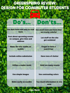
I created a poster with a list of these “do’s and don’ts” to aid in designing a website that is easier for commuter students to utilize. Research conducted by HubSpot.com reveals that when asked about the most important factor in a website, over 75% of respondents stated they rank ease of finding the information at the top (Kucheriavy). For my do’s I wanted to focus on making the site more accessible but more usable in a sense of ease of access for use on mobile. As many commuter students use the site on mobile the focus on mobile access is crucial. I also wanted to focus on the ease of reading, as putting dark fonts and easy to read texts will help mobile students better read the site. I also sought the need for the site to post about upcoming events with a time and address to give more information to the students who live off campus and may need further information to get to such events. I also included the use of an online submission tool which seems self-explanatory but a tool is useful for students who are using the site outside of the Stevenson network. As the focus is on mobile usability, I sought the importance of utilizing a reader mode to make mobile use easier and more capable for situations where one may be experiencing bad or a lack of internet connection. Lastly, I sought the use of simple images as complex and large images make the site harder for mobile students to load and navigate as it may take up more than the usual amount of space.
For the don’ts on the design for the website I again focused intently on mobile usability. Study participants found sites with a mix of desktop and mobile-optimized pages even harder to use than desktop-only sites (Gove). The use of small and overly colorful fonts and texts makes reading the site much harder and what may look good on a computer site does not always transfer to a mobile version of that site. Also, it’s important to let information on the site get out of date which ties in with clutter as out of date information leads to a ton of clutter on the site. I also highlighted the importance of not forgetting a search bar as this is one of the most important and usable aspects of any website. Furthermore, posting too many events ties in with site clutter and posting what is important and relevant will help refrain from clutter and will aid in usability. Lastly, having too much information in one area of the site can hurt the mobile usability and spreading out the information in a concise and useful manner will make the site much easier to read for mobile users.
Gove, Jenny. “What Makes a Good Mobile Site?” 2019. https://developers.google.com/web/fundamentals/design-and-ux/principles
Kucheriavy, Andrew. “What Makes a Website User Friendly?” 2020. https://www.intechnic.com/blog/what-makes-a-website-user-friendly/