The Villager is a user-friendly newspaper that caters mostly to students who want to quickly access concise and brief information while staying up to date with Stevenson related news. The Villager accomplishes this by creating a fast and easy to use layout and publishing relatively short length articles.
The Villager’s front page is heavily populated with images. Clicking on any of these images will then take you to the article. Although the reader can sort their news by category, the user can also easily access the featured articles since these occupy the largest area of the front page and rotate every few seconds.

The colors and font choices are standard for any newspaper apart from the header. The title heading indicates that the newspaper reports on Stevenson related news by using the University’s colors and a large, bold font. The body text is in black in an easy to read font against a white background.
The article thumbnails are well-spaced out and do not feel cluttered. All articles appear to be accompanied by an image and occasionally a video. Although The Villager occasionally uses videos to complement the articles, these do not automatically play. As such, The Villager makes very little use of sound.
The university newspaper has a very minimalistic feel to it. Articles are organized into a grid-like front page making it easy for anyone to find their way in the website. The left and right side of the page are usually left blank, which helps frame the articles into a position where the user typically expects them to be. Another great use of space is the simple pop-up that appears at the bottom right of the page when the user is about done with an article. The pop-up is not invasive, it does not occupy a large section of the screen and does a great job of guiding the user to the next article prolonging the time the reader spends on the website.
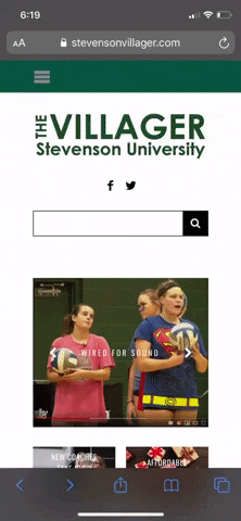
The desktop website offers very little gestural interaction. The most a user will do on this website will be point, click, and scroll. However, The Villager does offer a mobile version of the newspaper in which the gestural interactions will resemble the typically interactions with mobile apps such as Instagram and reddit. The user simply swipes down to scroll through the various articles and then taps on the article they which to read. This facilitates navigating the newspaper by offering a familiar layout to the reader.
This online newspaper makes use of various modes to deliver an effective but simple experience. The major benefit of The Villager is that it is fully online. This affords the user the opportunity of accessing previous issues of the newspaper through the archive tab, searching for a particular topic by using the search bar or the tag feature and watching videos related to Stevenson. It also offers a subscription feature which lets the reader receive the newspaper in their email inbox. The downside of The Villager is the lack of sound, and the lack of interaction that it provides for the user.
In conclusion, The Villager does a great job of captivating its primary audience through an effective use of the spatial and visual modes which provide a simplified but effective experience for the user.
1. Is the thesis clear and debatable. Does the author express an opinion about the site?
Yes, the thesis is debatable. The opinion of the newspaper is that it is user-friendly and accomplishes this with a fast and easy layout and shorter articles.
2. Does the author analyze at least two modes? Does the author provide specific evidence of each mode?
The modes analyzed include visual, spatial, gestural, and aural. There is specific evidence of each mode. You really go in depth with the visual, spatial, and gestural modes. The explanation of the front page and the layout of the page is nicely done and backs up your thesis.
3. Does the author identify the affordances of this site? Do the affordances connect back to their thesis?
The affordances of the site are identified. You talk about how the online publication offers a simple and user-friendly experience and all of the abilities that this has, including subscribing to the publication. The affordances connect back to your thesis of arguing that the site is easy to use and contains a simple format.
4. Does the author provide screenshots that relate to the evidence provided? Is it clear why the include these specific images?
You use good screenshots and screen captures throughout your analysis. I really like the screen capture associated with the gestural mode, as it is easy to see how you are interacting with the site on your phone. I also like the capture of the rotating pictures and articles on the front page. It is clear to your audience what you are describing.