Rhetorical Analysis Parts 1 and 2
Audience
The primary intended audience of Heifer.org seems to mainly be people looking to donate to the Heifer foundation. These possible donors are likely people looking to end world hunger. In addition to attracting potential funding, the website also aims to inform visitors about their mission and the issue of world hunger. A secondary audience of people trying to learn more about world hunger and its effects both locally and internationally is also reached. The website is only offered in the English language implying that its intended audience is English speakers. Based on their location here in the United States, one could further narrow down Heifer’s intended audience to being possible American donors or Americans researching Heifer and world hunger. There is a sub-menu allowing for donations to be placed that specifically go to empowering women. This adds another dimension to Heifer’s possible audience as well as their purpose. Both are broadened to support of women and ending hunger as well as donors interested in contributing to either cause.
Purpose
This website’s primary purpose is to raise money for the Heifer Foundation and the various projects and charitable actions they provide. As soon as a visitor logs on to the site they are presented with this pop-up screen that pushes them to identify as a donor. 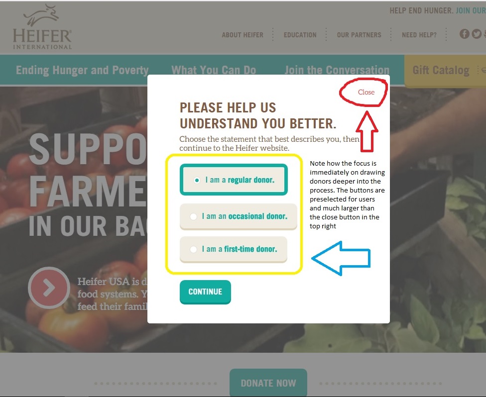
Due to the immense amount of information available on Heifer’s website, their secondary purpose seems to be bringing awareness to the issue of hunger on both international and local scales. The tertiary purpose seems to be informing the public with information regarding how they are working against world hunger. This is supported by Heifer dedicating a large portion of their website to describing the methods they use to provide their services to those in need.
Context
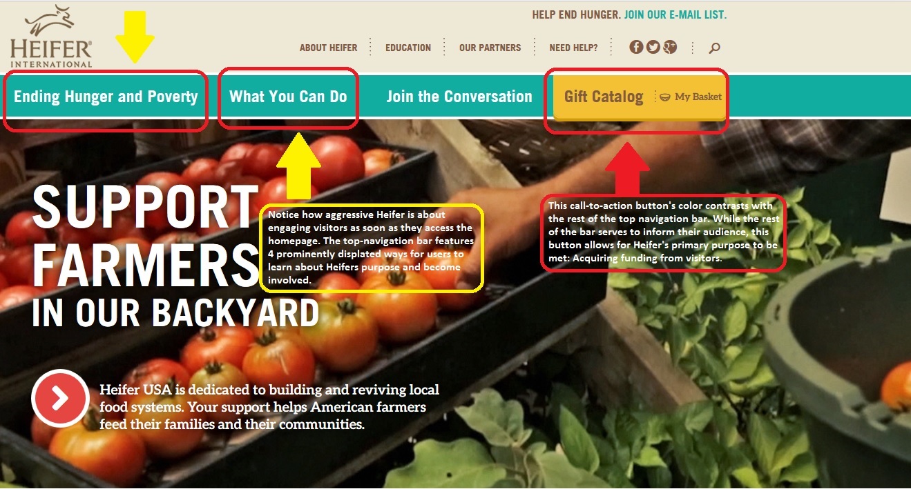
If you put heifer into your preferred search engine their website is usually among the top results and features a brief statement to provide some context to visitors before they click the lnk.

Heifer.org fully utilizes its online medium to present itself to readers. The text is laid out in an interactive format on the Heifer website. Readers navigate maps and other interactive graphics and menus to learn more about Heifer’s work, the issues surrounding hunger and nutrition worldwide as well as possible ways to contribute to Heifer in order to aid them in their mission.
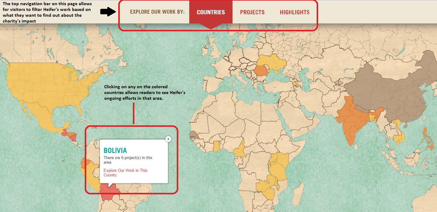
These information graphics are easy to use and stand especially when compared to the information architecture on other sites. The designers of Heifer’s website spent a lot of time allowing a user to get lost in their information without becoming disoriented. No matter how deep into the charity projects or catalog you go, the top-navigation bar allows a user to keep their sense of direction within the site.
Heifer’s online context allows them to easily convey large amounts of info about themselves and allows for easy donations and purchases from their online store via credit or debit cards from visitors. Being an online publication/foundation with credit card processing capabilities allows for much easier access to customer/donor funds.

Notice how the donation slider comes preset to the most expensive standardized amount on their donation pages. Their online presence allows for them to draw donors in for larger sums than an in person, door-to-door charity campaign would simply by their ability to process credit cards.
Genre
The Heifer website most closely falls into the genre of online charity organizations. The amount of information on the site also adds an educational/informational aspect to it. Readers are constantly presented with facts about the issues of world hunger and different ways that Heifer is working to end it. In addition to a constant information screen, visitors are frequently and boldly prompted to donate via pop-ups and boldly placed call-to-action buttons. Small touches like calling the “cart” the “basket” and letting visitors choose who/where they donate to make the website feel more personal and less generic.
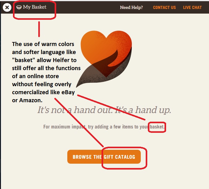
The careful, gentle wording and is an effective quality in a website that’s main purpose is to acquire donations. The warm colors featured by Heifer also aid in this feeling of comfort. Even the cooler colors like blues and greens used on their front page are soft and provide a gentle but effective contrast against their call-to-action buttons.
Font
Most of Heifers text is written in brief, easy to read blurbs in a font that does not use any serifs to possibly disorient dyslexic visitors. The writing is well spaced and formatted well enough that a reader’s eye naturally finds the next line or latches onto the next blurb down the screen.
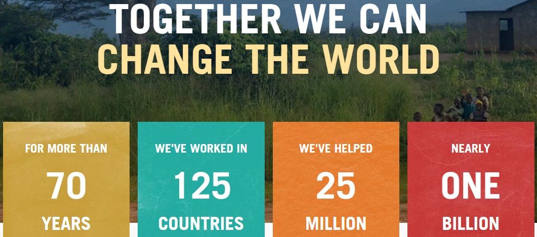
The above font is easily readable , the layout is simple and the message is clear. The colors are all very muted but distinguishable against one another and allow for the plain white text to be easily read.
Author
No actual author is given credit or mentioned in any of the articles or parts of the website. The implied author is one that cares deeply about the work of Heifer and wants to inform the readers as heavily as possible about their work and the benefits that a donation will have on the work.
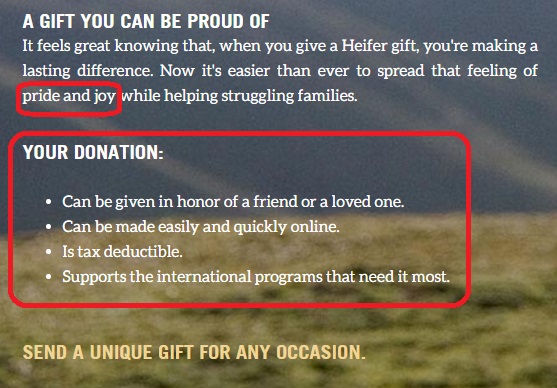
The author of the above image has a clear and persuasive voice. The benefits a donation would have are clearly listed for visitor’s through the use of persuasive language like “feeling of pride and joy” and “you’re making a lasting difference.” That firm but persuasive voice makes readers want to please that author and donate to Heifer.org.
Rhetorical Analysis Part 3
The primary audience for heifer.org is possible donor’s. These are visitors who come to the site to make a donation. Though the Heifer organization is a charity, it is run like a business and acquiring funding is still their primary goal, which makes potential donors their primary audience. Due to the immense amount of information also featured on the Heifer site, they reach a secondary audience of people who are looking to learn more about issues like world hunger and their effects on both a local and international scale. Countless pages of information on these topics are featured on the site and feature easy to read graphics like graphs, maps and photos to show readers what hunger looks like, how it affects people and what Heifer does to help. The primary purpose of Heifer’s site as mentioned above is to acquire funding, which does make them biased in their mission, though it is not necessarily negative bias. The side of the argument that Heifer presents and favors is their side. Heifer wants you to donate to them, rather than donate to a local food bank or other charity. It is an understandable bias to have considering that Heifer’s site functions to run a truly massive international charity.
The online medium utilized by heifer.org is what makes running their charity on such a massive scale possible. The website layout makes it super easy for donations to be taken by credit card processing software and allows for them to also run an online store to help fund their projects. Tons of pictures, graphics and interactive menus engage readers and all seem to somehow lead back to a donation button without Heifer seeming pushy or too assertive. These multi-modal elements make for a smooth and interesting user experience as readers are able to absorb cultural facts and statistics about hunger while they contemplate making their donations. Links and tags to other articles and pages on Heifer.org are abundant and a user can spend hours browsing the sites dense content.
When creating this rhetorical analysis I only used the screenshot key to capture images and the program MicrosoftPaint to crop and label the examples from Heifer’s website. I’m not a very tech savvy guy and I was pretty intimidated by the idea of recording myself using a computer, using unfamiliar programs or trying to narrate my technologically-challenged stumbling through Heifer’s website. The process I used to make this simply involved me copying and pasting the assignment requirements into a blank post, then answering the questions, then finding graphics to support my answers. This method was fairly simple and allowed me to stay organized. Though it may have been painful for you, thanks for sticking it out through all the 1376 words in this post.
