
introduction
Heifer International is non-profit organization that serves to eradicate hunger and poverty globally by developing self-efficient communities and donating livestock to those agricultural communities. In order to succeed in their efforts, Heifer has created a website which has a number of features for donations as well as avenues to view their progress on the development of communities where they have a presence. I will be analyzing the site in order to establish how things function and if they succeed in generating interest in Heifer’s efforts.
Audience & Purpose
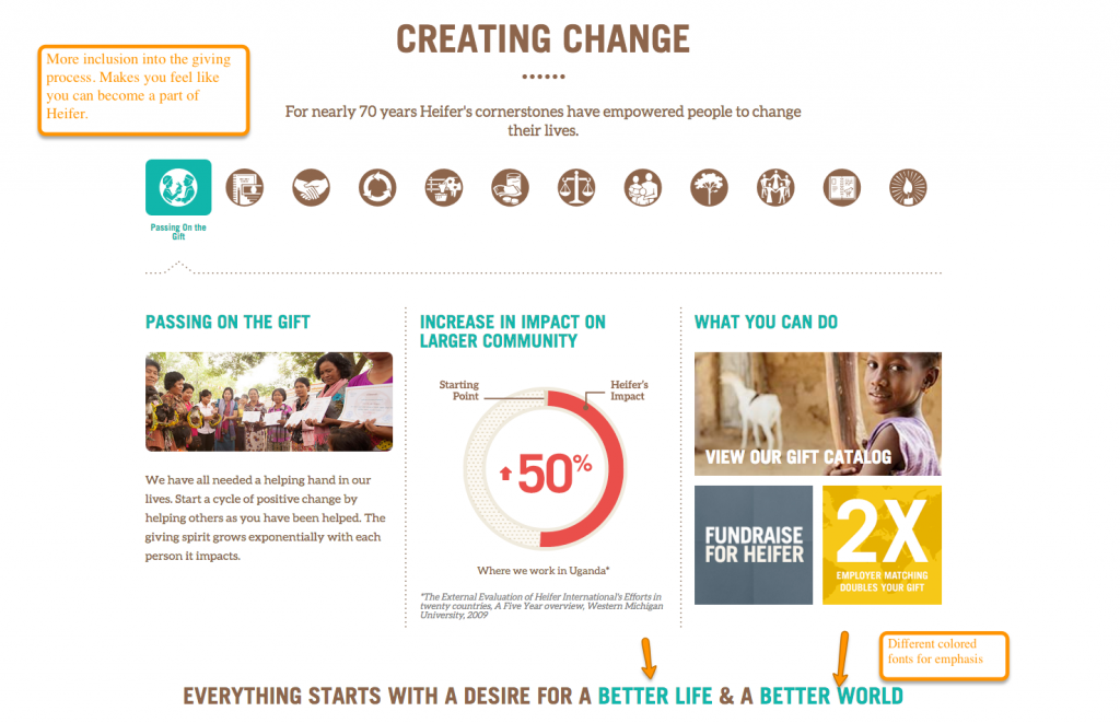
For starters, the audience for Heifer International are clearly individuals interested in entering the fight against hunger and poverty worldwide. The site is constructed in a way that invites a secondary audience in with a beautiful and engaging conglomeration of media and text that blend beautifully together. One of the primary purposes of Heifer International’s website is introducing an uneducated audience to the hunger and poverty plight around the world. It achieves this by having a large amount of carefully detailed graphs and statistics about the hunger epidemic around the world. Secondarily, the site also shows Heifer’s philosophy and business strategies throughout the world, including how the donations given to Heifer affect the communities and the various types of livestock that can be donated to struggling communities. There is an obvious bias, however since as a nonprofit, Heifer requires donations to function so it is of the utmost importance that they make their mission seem like it is both urgent and successful.
Medium
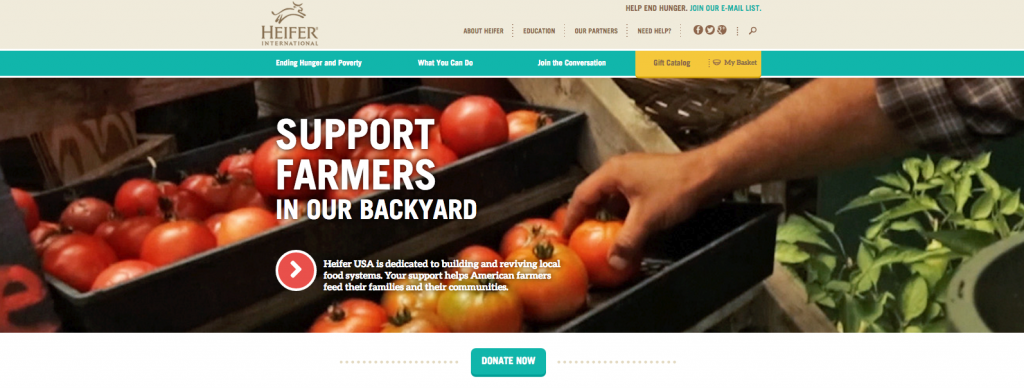
The choice of a website in the modern age instead of a magazine is very crucial as through the site’s meticulously planned layout, it’s much easier to get to the sections that you actually want to get to. As stated before, the site is filled with pictures and graphs, detailing the statistics of the hunger issue while giving a powerful and positive outlook due to their work. The beige, green and yellow tones of the site are nice choices. They’re good colors without being distracting but subtle without being boring.
Font-wise, the white and browns stand out against beige and green backgrounds. For further emphasis, Heifer’s designers have also included various reds and blues in their heading font selections that draw attention to whatever the site is addressing.
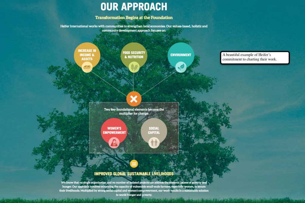
Information Architecture
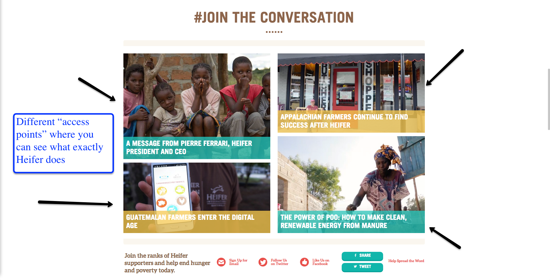
The site is designed in a way where most of the most basic information is placed directly on the home page. By reading the home page, an interested can see what Heifer International is about and see what they believe. However, if more information is desired, Heifer has their information bar on the top that directs you to their views and their approach to eradicating hunger.
personal experience
Overall, I greatly enjoyed Heifer International’s website. I usually visit websites like this but I found myself lost in the rabbit hole, per se. There’s so much information to read and it’s presented in such an interesting and visually pleasing way that it’s extremely hard to back out once you’re fully invested in getting in.
The information is easy to access and every link seems to take you to a page that constantly reemphasizes the importance of Heifer’s mission and shows you just how widespread their reach is. It’s both inspiring and a bit daunting, knowing just how large their mission is. Because of this, it almost makes you want to donate because it isn’t an easy thing that they plan to do.
On a scale of 1 to 10, I’d definitely give heifer.org a 9.75, if only because when you first access the site, they try to hit you with a donate now sign up page that is a bit frustrating and annoying.
Howard McMillan, Jr.