Final Reflection

Reflection Assignment

In Authentic Learning in the Digital Age: Engaging Students Through Inquiry, Larissa Pahomov writes, “For student reflection to be meaningful, it must be metacognitive, applicable, and shared with others,” and defines metacognitive reflection as taking the process of reflection “to the next level because it is concerned not with assessment, but with self-improvement: Could this be better? How? What steps should you take?” In light of this assertion, I would like you to write a metacognitive reflection on the final project of the semester and your presentation. This reflection should address the following questions, with an aim to identify how you could improve your work.

  1. Describe what you learned in this class. What skills did you acquire? Do you think your writing and editing skills improved? Do you feel your technical skills improved?
  2. How effective was your use of revision strategies in this class? How did you use your peers’ critiques to improve your writing? If applicable, what other revision techniques did you use and why?
  3. How do you feel you contributed to the class discussions? How did you facilitate communication and collaboration between members of the class? Did you feel that your contribution to the class discussion was sufficient? How might you change your involvement in class discussions in the future?
  4. Do you feel the service learning component enhanced your experience in this class? How did working for a real client change the way you approached your assignments?
  5. And finally, what readings, activities, assignments, and discussions did you find particularly helpful, informative, and engaging in this class this semester? What would you suggest be changed to improve this course next time it is offered?

You may expand or add to these guidelines in any way you wish. This is your opportunity to speak directly to me about what you learned in this course. This reflection should be about 2 pages long, but you may go over that page limit if you wish.

This will be worth 20 points, and should be submitted as a Google Doc (title: finalreflection_yoursection_yourlastname for example finalreflection_256_licastro) that you share with me upon completion. You must invite me as an editor (with privileges to edit, not just read or comment). You must share this with me before the day of our scheduled final exam (5/9 at 1:30pm).

Also, please include this statement at the bottom of the document and fill in your name and response:

I ____________ do/ do not give Dr. Amanda Licastro permission to use my final project as an example in scholarly presentations and publications.

Book Traces

Book Traces was my favorite extra credit event for this course thus far. It was interesting to learn how books were used in such different ways; they were more than just reading tools. People bonded through books, they were gifts, and much more. I hope this movement gains even more success than it already has in such a short period of time. The more people who are aware of these hidden gems that libraries hold, the more books will be found and evaluated. It is so ironic, yet fascinating that there are real life stories embedded within the basic story (the existing book). The technology that exists today easily allows us to really find out the root of what was in the books. It’s exciting, and this could come in handy one day.

I really appreciate the fact that Stauffer took the time and visited Stevenson all the way from Virginia. I believe it would be a great idea for him to continue to travel to other universities, libraries, and etc. to educate people on this. It would be a shame for books to be overlooked and thrown away when there is so much to discover. The success he has thus far already had proves that he is onto something.

Annotated Bibliographies

Annotated_Bibliographies

An annotation both summarizes and evaluates the material found in a particular source. When writing an annotation you should answer these questions:

1) Who is the author, and what is his/her authority or background?

2) What is the author’s thesis? What are the author’s main claims?

3) Who is the author’s intended audience?

4) Is there any bias or slant in the article/chapter/book/site?

5) What are the strengths and weaknesses of this source?

6) Does the information in this source support or counter the thesis of your research paper/project?

7) How relevant is this material in terms of your paper/project?

Example: https://owl.english.purdue.edu/owl/resource/614/01/

Elevator Pitch- Brian Casciero

The Asylee Women’s Enterprise is an organization providing assistance to those seeking asylum to America, offering housing, community, and friendship to asylees in their time of need. In its marketing, the organization has stated that it wants the asylees to be viewed as human and relatable but also as hopeful, determined people who need help. Emotional pleas based on pity should be avoided.

One of the most key players in the success of the Asylee Women’s Enterprise is the donor; the organization heavily relies on donations of money, clothing, and more. The AWE website currently contains a donation section on their homepage that is not eye-catching or attractive. From looking at the “Donate” page, the link to donate is not immediately apparent because it is a simple, small hyperlink at the top of the page. AWE needs potential patrons to immediately see its priorities, recognize a call to action, and perceive credibility. The solution to this “Donate” page is to achieve these goals while holding true to AWE’s values and how they wish to be perceived. I propose that a strategic, informative photograph next to an action button is the best way to reach this outcome.

Visual grammar is the structure and relationships within a visual representation as it makes a particular statement to the audience. Kress and van Leeuwen, the pioneers of visual grammar, propose that one of the functions of visual grammar is the interactive meaning. The interactive meaning frames social relationships between audience, author, and visual “participants,” culminating in an evaluation of the world. This contains the four elements of contact, social distance, attitude, and modality. Each of these elements are tools for strong statements when used correctly (Hu and Luo 157-158). The “Donate” page on the website should strive to display asylees as strong and hopeful using these components.

Kress and van Leeuwen also state that strong visual grammar requires a narrative process. In an action process like this one, there are two types of sub processes, transactional and nontransactional. A process is transactional when there are two aspects of the visuals that represent the actor and the goal (Hu and Luo 157-158). For AWE, the actor should be the picture of the asylees that shows them in a positive light. The goal will be the donation button. There will be a logical process for the patron to follow.


Hu, Chunyu, and Mengxi Luo. “A Multimodal Discourse Analysis of Tmall’s Double Eleven Advertisement.” English Language Teaching 9.8 (2016): 156-69. ERIC Institute of Education Sciences. Web. 21 Mar. 2017. <http://files.eric.ed.gov/fulltext/EJ1106632.pdf>.

Elevator Pitch

For your final project you will be composing one multimodal text to be featured on the new website for AWE. The first step in this process is to pitch your idea to our editorial team (your classmates). To accomplish this you must present:

  • A 350 word abstract in MLA format. Post this to the blog under tag “pitch.” Find examples here: http://www.umt.edu/ugresearch/umcur/sample_abstracts.php
  • A description of your intended audience and an explanation of how you will reach them.
  • A clear purpose and an explanation of why this information should appear on the AWE website.
  • Citations or evidence of research.
  • Your plan to incorporate media.

You will have 5 minutes to present, and I will time you. Think of this like a Shark Tank pitch. You want the presentation to be convincing, dynamic, and well researched. Be prepared to answer questions from the audience.

We will work on these in class on 3/9 and you will present them on 3/21.

Style Sheets

For this class you will make your own style sheet to use for editing our content. Here are some resources and examples:

Academic writing style guide: http://twp.duke.edu/uploads/media_items/academic-style-guide.original.pdf

Editing style sheet overview: http://tweedediting.com/2011/06/style-sheets-for-academic-writers/

https://www.grammarly.com/handbook/academic-writing/how-write-research-paper/3/using-style-sheet/

https://www.universalclass.com/articles/writing/style-sheets-and-other-copyediting-specialties.htm

http://www.quickanddirtytips.com/education/writing/how-to-make-a-style-sheet

Sample style sheet: http://tweedediting.com/wp-content/uploads/2011/06/SampleTweedStyleSheet.pdf


Rhetorical Analysis for refugees.org

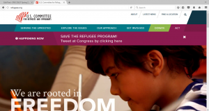
The site that I chose to analyze is www.refugees.org, the website of the U.S. Committee for Refugees and Immigrants
Audience

The primary audience of refugees.org is people who want to learn how they can help refugees who are trying to get into the United States for better opportunities. The secondary audience is people who care about the issue of refugees and want to learn more about the issue.

Purpose

The purpose of this site is to inform and to educate web viewers about both the issue of refugees, what the committee does and how it handles doing it.

It could be argued, though, that it has a bias since the opposing argument would be the fear that terrorists would take advantage and sneak through our borders to carry out more terrorist attacks. While the website does not counter this argument, presumably since it does not want to get involved in a political loophole, it simply states the facts and only tells the audience how they can help refugees instead of advice on how to win an argument with someone who wants to bar refugees from coming into our country.

Context

The context of refugees.org is rooted in its color scheme of light colors to give the viewer a feel that the committee is dedicated to what it feels is right in helping refugees. From the picture of the homepage, the white outline makes the site seem educated on the refugee issue and the text is in black since other colors would be distracting. Whenever there’s an alert, a tab appears in dark red at the top of the web-page to catch the viewer’s eye, showing that action has to be taken in order to ensure that the viewer can immediately help out even if the viewer hasn’t navigated the entire site. The other navigation sections are colored in light blue, which makes the website seem positive about its message. Several pictures of committee members meeting with politicians and congressional hearings as well as refugees sitting around are also displayed to show that the committee is dedicated to helping refugees since it sees the issue as very serious and wants the viewer to think so too.
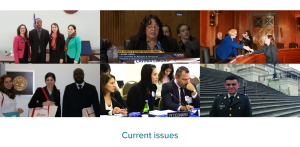
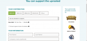
In fact, the website relies more on images than actual text to make the site feel more welcome rather than being overloaded with information that can make it seem too tiring to read. The donation and the act tabs are designed in bright green and dark red to make them stand out from the other tabs so that the audience can tell what is action and what is information. The donation slider is set at the cheapest amount at $40.00. Viewers can also select whether to do this once or monthly. With a website, the committee now has the opportunity to draw donors in for larger sums of money than if a committee tried to receive donations via door-to-door or fundraiser activities.
Genre

The genre of the website can be categorized as an online charity. There’s a lot of information on the website both about the committee and how a viewer can help that makes the website seem educated and resourceful. The facts about refugees are constant and always present. The viewer isn’t told constantly, however, to donate as he or she keeps reading. Instead, the home-page has quick little videos that make viewers feel welcome and that they have come to a place where they can help contribute to helping refugees find a safe and comfortable home.

Author

While no credit is given to who authored the site, the implied author is the United States Committee for Refugees. The actual author, or authors, is someone that strongly supported the committee’s cause and wanted to reach out to internet surfers to get widespread attention.

Font

While their isn’t much text written on the website, since it prefers to use pictures, the text that is provided is written in short and concise sentences that quickly summarize the problem and the committee’s solution. This was probably done to stop the site from boring the reader, but the layout is straight-forward and the message is clear because the text is spaced and formatted in a way that the viewer can follow without becoming disorienting.

Interface

The interface enhances the experience with all the features that are designed to attract the viewer’s attention. The colors are vivid at the right tone to keep the viewer engaged.

Information Architecture

The information architecture is simple as the short text sentences. If the viewer is convinced and wants to contribute, they can go to the bottom of the site in a blue column headed “Support the uprooted” and select either “Donate” or “Get Involved”. If viewers want to know more, they can go further down where there’s a darker blue column with four rows, each headed “Connect”, “About”, “Explore” and “Resources”. As a result, the site is easy to navigate to the point where it’s almost impossible to become lost.

The tool that I used in creating my analysis was JING since it was the easiest to capture screen shots and implement them with my rhetorical analysis. I’m not good when it comes to internet design hence the reason the pictures may be blurry. But having the photos with my analysis helps the reader understand what I am describing as I analyze refugees.org. I didn’t want to overload my analysis with photos, though. I only used images that seemed necessary in order to understand what I was talking about.

Rhetorical Analysis Assignment

In class we practiced analyzing print sources – books, magazines, etc – using rhetorical conventions. For this assignment, you will compose a rhetorical analysis of one of the following websites:

www.refugees.org

Heifer.org

Savethechildren.org

  1. First, you need to choose one website to focus on. Then, you need to determine the audience, purpose, context, author, and genre using the handout provided in class. You should address each of these topics thoroughly with direct evidence from the text and your research. You must use MLA citations for any information you summarize, paraphrase, or quote.
  2. Next, you should include a through an analysis of the information graphics used in the text you have selected. You should also provide an analysis of the interface – in other words the platform the text is published in – and how that interface affects your experience of the text. When analyzing the interface consider color, font, information architecture, and user experience. You should analyze how the visualizations were made,  what argument the visualizations are making, and how that argument is presented.  To do this you may use https://hypothes.is/ , screen captured images (I suggest JING), screen captured videos (I suggest Quicktime or LiceCAP), or printed images with hand drawn annotations. The idea is to walk your audience through your analysis visually and alphabetically.
  3. Summarize your rhetorical analysis. Tell me what you learned from creating a multimedia essay about this site. Included in your post for the rhetorical analysis assignment, please include a short written statement that addresses the following:
    • Who is the audience for this site? Who is the secondary audience?
    • What is their purpose for this site? Does it have a bias? Explain.
    • How did the medium shape the argument? How did the author(s) utilize the medium to make their point? What media/links/tags are included? How do these multimodal elements relate to the information presented in the text?
    • How did you use the tool you choose to make your arguments about the article? What was your process in creating your analysis?

    This should be 1-3 paragraphs long as an accompaniment to your video/images/annotations.

This is due by midnight on 2/17. It should be posted as category “blog” and tag “rhetorical analysis.”

This project is worth 25 points.