
- Do you think AI can ever surpass the human brain?
- Is there a point where using AI becomes unethical?
- In learning about the stories behind a brand, are readers more willing to accept that they’re being marketed to?
Author: bcasciero
VR Reflection- Brian C
What did you experience?
I watched a story about Abraham Lincoln visiting the graveyard where his son is buried. Throughout the story, several spirits talk to the viewer about the story’s background. At one point, spirits are gathered around Abe as he holds his son’s body, and the viewer feels like part of the crowd. The spirit of Lincoln’s child proclaims that he could feel his father’s long legs and taste the coffee in his mouth. He declares to the other spirits that his father gained something from holding his dead son. Lincoln then puts his son back in the mausoleum and walks away.
What impact do you think VR will have on publishing?
I think, at this point, VR is still inaccessible for most of a publication’s audience. Even with cheaper cardboard viewing devices, it is asking a lot of people to even set up the VR in the first place. Perhaps as VR becomes more mainstream and in the hands of more people, it could have a wide impact. Certainly, any story told through the eyes of VR is still journalism, so it is already a form of storytelling.
Do you think VR can evoke empathy?
I think VR can evoke plenty of empathy. By placing a 3D camera in an area, the film subjects are less likely to modify their behavior. In fact, some may not even notice at all. This means the viewer gets a more genuine experience that is not tainted by editing. Seeing people or animals or plants as they naturally live is always a refreshing view. I agree with the TED speaker that 3D video allows us to be part of an experience rather than view it. We do move through the window.
Donate to AWE
The people we support at AWE have not only fled injustice or tyranny; they have taken it upon themselves to change their lives. We commend the courage needed to step into a new, foreign land. That is why, through your donations, we seek to uphold these virtues of hope and faith.
We know it can sometimes feel like smoke and mirrors when donating to a nonprofit. At AWE, we show you exactly what your money goes towards with our new AWE Stretch Goals. Below, you can see specific goals we reach with total amount of money donated. With your help, we can reach milestones such as providing housing for more asylees and offering new classes. for them to take.
AWE looks towards tomorrow – a day we can help even more asylees with the utmost care and passion. We can only make this progress with your generous support. Join us in our quest, one dollar at a time.
AWE Stretch Goal- Asylee Apartment Housing
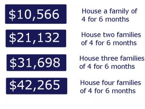

The asylees who flee their countries for better prospects are often doing so under heavy financial stress. To make matters worse, when they arrive in the United States, asylees must deal with a new currency and a new cost of living, all while adjusting to a new language.
AWE wants to cover the apartment rent of as many asylees as we can. If you donate today, your money will go directly to our above goals of housing families. With their rent covered, these individuals can better focus on creating a new life for themselves.
Rent estimates taken from:
Josephson, Amelia. “What is the Cost of Living in Maryland?” SmartAsset. N.p., 09 Aug. 2016. Web. 28 Apr. 2017.
Annotated Bibliography- Brian Casciero
Cohn, Neil and Patrick Bender. “Drawing the Line between Constituent
Structure and Coherence Relations in Visual Narratives.” Journal of Experimental Psychology: Learning, Memory, and Cognition, vol. 43, no. 2, Feb. 2017, pp. 289-301. EBSCOhost, doi:10.1037/xlm0000290.
The authors are Neil Cohn of Tufts University and Tilburg University and Patrick Bender of Tufts University. They reject the notion that visual grammar, instead of focusing on changes in meaning, revolves around categorical roles for images (narrative structure) The intended audience of this piece consists of those already familiar with previous theories of visual grammar, which are most likely academic researchers or those pursuing education in the subject. Additionally, there is little to no bias shown in the article.
The main strength of this article is that it provides a refreshing viewpoint on visual grammar and offers another perspective. The weakness is that the results in the study indicate that viewers are more aware of meaning shifts than they are of narrative structure. Though the authors concluded that narrative structures are more influential overall, they are not the clear-cut champion of visual grammar. The information in this article supports my thesis because it states that viewers are less influenced by a piece’s sequence changes. I state that viewers are driven by their own statements and the piece’s statements about the world around them. Worldview statements are categorical, narrative roles described by this paper. This material is very relevant, as it supports my claims by breaking down commonly held beliefs on visual grammar.
Cohn, Neil, et al. “The grammar of visual narrative: Neural evidence for
constituent structure in sequential image comprehension.” Nueropsychologia, vol. 64, Nov. 2014, pp. 63–70. ScienceDirect, www.sciencedirect.com/science/article/pii/S0028393214003236? Accessed 4 Apr. 2017.
The authors are Neil Cohn, Ray Jackendoff, Phillip Holcomb, and Gina Kuperburg. They all work in the Psychology Department of Tufts University. They claim that viewers use a narrative structure when viewing images, offering results of a study. The study shows that the human brain feels disruption when there is a pause in a comic strip. The author’s intended audience consists of those familiar with psychology, neurology, or visual grammar.
The article has no bias. The biggest strength of this article is how it shows the brain’s involuntary actions, cutting deep with undeniable evidence. The one weakness the article has is the study’s relevance to all aspects of visual grammar. The study involved comic strips, which are far different from a single picture. The information here supports my thesis, but the interpretation of the study is not the most useful for my specific use. This material is not as relevant because of it is not as useful as the others. Nonetheless, it supports my project very nicely.
Hu, Chunyu, and Mengxi Luo. “A Multimodal Discourse Analysis of
Tmall’s Double Eleven Advertisement.” English Language Teaching, 3 July 2016, http://files.eric.ed.gov/fulltext/EJ1106632.pdf.
The authors are Chunyu Hu and Mengxi Luo. They are both writing from the School of International Business at Guangdong University of Foreign Studies in China. They claim that Visual Grammar, as defined by Kress and van Leeuwen, is the driving force in visual advertisements. The authors also claim that effective visual advertising communicates through cultural and social statements about the world.
The intended audience most likely consists of business marketers wishing to improve their visual communication. A secondary audience may be those interested in the sociological and psychological effects of advertising (perhaps psychologists or sociologists). There is no bias present in this article; arguments are based in objectivity and on solid research.
This resource is a strong contribution to our visual marketing on the AWE site because it details specific strategies backed by research. However, this resource cannot be completely applied to video advertisement because analyzing video requires frame-by-frame analysis. Nonetheless, this source supports my thesis that people rely on interpretations of the world when viewing marketing. It is very relevant; visual grammar is a framework for any visual marketing and is therefore crucial to this project.
Questions for Chris Friend
- How is writing for the journal similar to or different than typical academic writing?
- How do you decide where to place images in your articles? (how you split up text with pictures)
- Can readers feel disrupted if they can’t read text from start to finish uninterrupted?
Elevator Pitch- Brian Casciero
The Asylee Women’s Enterprise is an organization providing assistance to those seeking asylum to America, offering housing, community, and friendship to asylees in their time of need. In its marketing, the organization has stated that it wants the asylees to be viewed as human and relatable but also as hopeful, determined people who need help. Emotional pleas based on pity should be avoided.
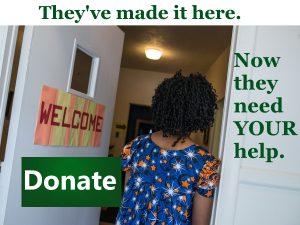
One of the most key players in the success of the Asylee Women’s Enterprise is the donor; the organization heavily relies on donations of money, clothing, and more. The AWE website currently contains a donation section on their homepage that is not eye-catching or attractive. From looking at the “Donate” page, the link to donate is not immediately apparent because it is a simple, small hyperlink at the top of the page. AWE needs potential patrons to immediately see its priorities, recognize a call to action, and perceive credibility. The solution to this “Donate” page is to achieve these goals while holding true to AWE’s values and how they wish to be perceived. I propose that a strategic, informative photograph next to an action button is the best way to reach this outcome.
Visual grammar is the structure and relationships within a visual representation as it makes a particular statement to the audience. Kress and van Leeuwen, the pioneers of visual grammar, propose that one of the functions of visual grammar is the interactive meaning. The interactive meaning frames social relationships between audience, author, and visual “participants,” culminating in an evaluation of the world. This contains the four elements of contact, social distance, attitude, and modality. Each of these elements are tools for strong statements when used correctly (Hu and Luo 157-158). The “Donate” page on the website should strive to display asylees as strong and hopeful using these components.
Kress and van Leeuwen also state that strong visual grammar requires a narrative process. In an action process like this one, there are two types of sub processes, transactional and nontransactional. A process is transactional when there are two aspects of the visuals that represent the actor and the goal (Hu and Luo 157-158). For AWE, the actor should be the picture of the asylees that shows them in a positive light. The goal will be the donation button. There will be a logical process for the patron to follow.
Hu, Chunyu, and Mengxi Luo. “A Multimodal Discourse Analysis of Tmall’s Double Eleven Advertisement.” English Language Teaching 9.8 (2016): 156-69. ERIC Institute of Education Sciences. Web. 21 Mar. 2017. <http://files.eric.ed.gov/fulltext/EJ1106632.pdf>.
Five Questions- Brian C
- Given the judicial system’s stance on the travel ban so far, do you think there is a lot of potential in legal services that represent refugees?
- Do you think verbal or physical abuse is more common in this issue?
- What role do you think social media plays in hateful rhetoric in the United States?
- Do you think there’s any potential legislation that could be passed to deal with verbal rhetoric?
- Do you think Trump’s election has incited a base of people that were previously hesitant to spread hateful rhetoric?
Rhetorical Analysis: savethechildren.org
Brian Casciero
2/12/2017
ENG 256-01
Rhetorical Analysis: Save the Children
Color Analysis

The colors red and white are present in many areas on the home page. Red and white invoke the concept of medical aid, as seen on hospitals and other medical facilities. It also gives a clinical, official feeling that harms the atmosphere of the site.

The red is present in the logo, the action buttons, and is a point of emphasis in this text box. This gives a sense of urgency. Being in the logo, it also gives the perception that Save the Children is committed to acting swiftly. The red coloring of the word “terrorized” makes a piercing call for sympathy and is somewhat manipulative.

Font
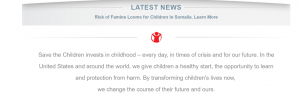
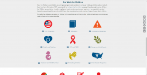
The “Latest News” section contains font that is slightly thicker and bolder than the rest. This is meant to attract attention. The smaller type font is reserved for the explanation paragraph below. If that were the same font size, users might be exhausted from reading that much large text. Finally, the pictures at the bottom contain thicker font. “120 Countries” and “185 Million” attract attention because the site wants us to remember those numbers.

Information Architecture
This is Save the Children’s About Us page. This section faces more towards corporations or investors; there is information about management, the board of trustees and corporate partners. This is clearly focused on creating a professional image. However, it is placed above this section on the About Us page:
The section of the page that most answers the “About Us” question is not placed on the forefront. Considering the main mission of the organization is in their work for children, this section should be above the previous, investor-heavy one. Instead, this creates the image of a company that cares more about business than it does its mission.
User Experience

The process for sponsoring a child is very streamlined. Right on the Sponsor a Child page, which is easily accessible from the home page, is a laid-out process for sponsoring. The four steps are visible and ready to be completed, giving the user a sense of control. This top portion is an easy way to find a child quickly; the site recommends a child for you, and you can select a new one from their choices. However, for a more advanced search, users can easily filter results.

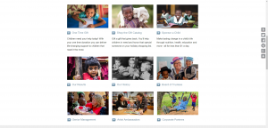
These information/link columns are at the bottom of most of the site’s pages. It is basically a condensed version of the site without the flashy effects of the homepage. It is laid out very directly and logically. For users who have reached the bottom of a page and might be looking for more information, the info will be right there. This prevents the user from having to backtrack too much and gives a sense of streamlining to the site. It is large and clear.
Summary
The Save the Children website is very direct in its intentions. While websites for other foundations may be slightly veiled about their emotional pleas, this site does not shy away from being honest. The audience consists of people wishing to donate or provide other assistance to the cause of helping children in need. A secondary audience consists of those wishing to volunteer, fundraise, or partner with the organization. The genre appears to be charitable foundation platform/website (“Official USA Site” 1).
The main purpose of the site is to make an emotional grab at the audience while providing the platform to take advantage of convinced patrons. A gift shop is easily accessible, and it is simple to sponsor a child. The site makes the path clear (“Gifts of Joy” 1). In a sense, Save the Children’s website has a bias towards making emotional pleas rather than letting patrons feel in control. The main bias towards generating support is still present, as it is in all of these platforms, but it is much more obvious here.
The bias presents itself through multimedia and the form of the text. The medium allows for picture slideshows, videos, and other visual interactive tools that provide a more direct and compelling argument. There are many pictures; some pictures are photographs that demonstrate the emotional grab. Others are meant for displaying statistics or other hard facts. Pictures allow users to see in-need children with longing faces and in sad, pitying positions. Video allows users to see examples of the text stories already provided (“Official USA Site” 1).
In the context of the current political climate, this website takes advantage of the Trump administration’s threatening stance on immigration. Now that the children may not be able to come to America, the emotional plea becomes more effective. Now possible patrons may be more inspired to assist the organization.
Sources Cited
“Official USA Site.” Save the Children. N.p., n.d. Web. 17 Feb. 2017.
“Sponsor A Child.” Save the Children. N.p., n.d. Web. 17 Feb. 2017.
“Home – Gifts of Joy for Lasting Change.” Gifts of Joy for Lasting Change. N.p., n.d. Web. 17 Feb. 2017.
“About Us.” Save the Children. N.p., n.d. Web. 17 Feb. 2017.