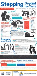
I really like infographics as a graphic designer, so I wanted to find a refugee infographic with good detailed information and I felt this one had a lot of information in it in a cool visual way.
I really like infographics as a graphic designer, so I wanted to find a refugee infographic with good detailed information and I felt this one had a lot of information in it in a cool visual way.
I am german and polish, but I like to relate more to my polish side, so I found an article about Polish migration that compared the happiness of those who migrated and those who stayed where they were. When people leave their home permanently, it is often for a better life, but is that what they are getting? Thing that is often looked at to mean more happiness and a better life, is money, health, social status, etc. There was a study showing that most people who migrated in the Eastern European countries were happier, with the exception those who migrated from Poland who were actually less happy than those who stayed. This article goes on to explain how the controlled experiment worked, the results, and the conclusions before continuing into discussions about the topic.
I found it interesting the results were so apparent that the others did feel happier, but the Polish migrants were basically unaffected. I was a bit confused by what exactly may be effecting them this way, they had charts showing “determinants of happiness” and how it effected them, but they were harder for me to understand. I also wonder how true this is for everyone and who exactly they talked to for the research. Especially after reading a book like Americanah where it was obvious the migrants in that book were not happy. This article also has no strong emotional words to sway perspective and opinions it was instead straight facts and evidence which was nice.
Bartram, David. “Happiness and ‘Economic Migration’: A Comparison of Eastern European Migrants and Stayers.” OUP Academic, Oxford University Press, 24 June 2013, academic.oup.com/migration/article/1/2/156/991931?searchresult=1.
Is Mexico really choosing to help for political reasons? My previous article talked about Mexico “helping” the united States with the amount of refugees for political reasons to not hurt Mexico’s and United State’s relationship. Though I found a new article from Mexico News Daily saying that it is not for political reason. The article, “Mexico Rejects US plan to extend ‘stay in Mexico’ policy for asylum seekers”, starts with announcing that Mexico does not agree with with the United States plan for refugees to stay in Mexico while they wait for approval to migrate to the US. They continue by saying the Mexican government is trying to help them by taking in returned refugees who were in dangerous border cities. They went to coordinate with the United states to help their people not to only please those in the politics. This article was also posted after the New York Time’s article and even quotes it themselves to try and further push their evidence to their point.
It is not fully disagreeing with the New York Times article, but it does say that the New York Times had things thought to be happening for the wrong reasons. Mexico News Daily is also unbiased and using strong emotional words. Again, in the headline this article uses the word “rejects” maybe not the strongest emotional word, but they could have used something more milder like deny, which to me seems less intense. I also believe the image they use in their headline on the page is more emotional and close to a false connection. It is related because it is migrants marching, but it is all black and white except for the family, has lots o children who look exhausted carrying heavy things across a dirty train track. That just screams “give us empathy”. SO both the articles I had were defiantly biased in a way.
Article Link: https://mexiconewsdaily.com/news/mexico-rejects-us-plan/
Is Mexico not allowing their citizens move to America? The article I chose from the New York Times: “Trump’s Surprising New Ally in Mexico? The Government” informs their readers about Mexico and their role in immigration. They discuss that Mexican authorities are preventing asylum seekers and refugees from migrating to the United States before they even reach the border. It also discusses Mexico’s new president’s, Lopez Obrador, role and he is currently choosing politics so he does not threaten his relationship with Trump and the United States. The articles also reviews the issues happening, for example the people who get stuck between the cities who are allowing entry and who are not or the people in danger in unfamiliar areas. Also, Trump wants asylum seekers to stay in Mexico while they wait for approval and the people try to flee the danger in their home are stuck their waiting with worry.
The New York Times is a relatively centered and credible, but they still use emotional words. A major one is in their headline, they use the word surprising in reference to Mexico potentially helping the United States. It is already swaying your thoughts with theirs that it should not be expected of Mexico. It also uses strong words like “violating”, “jeopardizing”, and “fleeing”. One strong paragraph said: When they begin talking about Tijuana, they talk about how “the Trump administration has plunged” asylum seekers and that they are “forcibly” sent, and then continuing to say “killings int Tijuana have skyrocketed“. The authors of the article could have used less strong, emotional words, to stay more centered in biases.
Article Link: https://www.nytimes.com/2019/03/01/world/americas/mexico-migration-trump.html
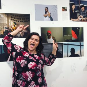
Reflecting Us is a very interesting and compelling exhibition between its creative work and strong messages that really make the exhibition. I was a part of one of the classes involved and was fortunate enough to have a piece selected and be one of the artist to talk at the event. The photographs are strong and have really amazing compositions, light work, and depths of field, but the awesome part is hearing the stories behind them. A few of the images have captions that tell you a bit about the back story, but it is really cool to heart the artists processes and decisions made to get the final piece. These images mean a lot to the artists to represent who we are in all kinds of ranges. The artists define themselves as black, as gay or bi, as a mental disorder, as a professional, as a minority, the range is phenomenal and these are our colleagues. It really shows how little we many know about each other, what we want the world to see us as and what we hide, and how we truly identify and intemperate each other or ourselves. I highly recommend spending some time reading the captions, flipping through the mini books made, or talking to one of the artists, you may learn something new!
I was upset I could not make it to Hernandez’s book reading, but enjoyed his talk in class and gained a lot of insight. A few things stood out to me about different aspects of the talk like digital publishing, how Hernandez got to where he is, and writing.
The main thing that stuck out about digital publishing is that it is changing a lot about who can get published and why. It is allowing more people to get published. Minorities, like women and people of color, are getting invited and welcomed to tell their stories and self publishing is opening up and getting easier for everyone digitally. They are even getting nominated and winning awards because of this opportunity. Another thing about digital publishing is it is cheaper. Hernandez mentioned that long poems take up a lot of space because they make so much negative space, for printed works, this mean more pages and ink which means more money, but digitally those factors disappear therefor it can be produced for less money.
I was very interested in his process of getting to how Hernandez got to where he is and the decisions he had to make to get there. one point he brought up a few times, the prestige of the print or publishers. He did not care as much if he got published digitally or physically, but he did care about the prestige of who was publishing it. His training as a poet also helped get him to success. Though he also writes short stories and he liked writing them for two reasons. You can send one to a publisher and then later send another to keep the connection going. It also pushed him to not be boring as a writer because he only had so many words to write an interesting story beginning to end.
My final note, Hernandez talked about putting your work out there and it really stuck with me as a fictional writer and a graphic designer. He encouraged writers to go to conventions and learn more about the community, to search for open markets, to hope to get published and paid, to get feedback, and to not give up. Put your work out there as soon as you can, someone right will see it, read it, and love it enough to get published. Hernandez reminded us that we will get rejected, but take the feed back and keep trying. And I think that was strongest point I took away from the entire talk because it is important to anyone in any field, keep trying.
I would like to pitch a “Dress for Success” kind of program to the Women and Children in need connected to AWE. AWE already has some programs to help with job applications and resumes, but do they have professional clothing to wear to the interviews? This program potentially could be volunteers who help them go out shopping for clothing and other items. It could also potentially focus on the children in the fall for a “back to school” shopping day for clothing or school supplies like notebooks and bookbags. A day to go somewhere, like goodwill, with help to get specific things they need to further themselves professionally. Dressing for success could also include resume building, linkedin classes, mock interviews, and interview daycare to make sure that they can be as successful as possible if the funds can support the program.
There are a lot of different types of digital publishing, magazines, articles, social media posts, ebooks, and more. And behind all of these different medias there is a lot of people helping create it and pull it together, but one that may be forgotten is the graphic designer, my career field of choice. We can design the imagery that goes along with that perfect marketing social media post, we design that layout of the magazine article, home page, and more, we even help design the ebooks by choosing the font family, font size, headings, and more. Yes, those simple details were probably help chosen by a graphic designer. All of it may not seem interesting, you may wonder who gets excited about choosing a font, a graphic designer does. We harshly judge websites, social media posts, magazines, menus, and more because blue is not just blue it is indigo, royal, navy, or baby blue. The fonts that all look identical are different because Times New Roman is definitely not Minion Pro and Arial is not even close to Helvetica. We can focus on the kerning, leading, cropping, negative space, and all the other little details because we learned how to have the eye for those things specifically.
More than taking those art and design classes, I have been focusing on some marketing classes, my goal specifically as a designer is to join a marketing, advertising, or social media team. So, taking a class in digital publishing will help me more so, because now I will be able to design those posts, but I also may learn more about the content of those posts so that I can do both for the company. I am hoping this class will get better at knowing all of the content, visual, linguistic, aural, and more to know when to use what and how to produce the content all around in a successful way. It could potentially give me a step up from other designers in the marketing field to be able to know more about different aspects of producing digital media. Then I can focus more on just the colors, fonts, and small design details, but the words written, the purpose of the post, the background and context. Digital publishing and graphic design very much go hand in hand and I know this class can help me in my career goals.
Can a website make you feel? Can it make you spend money? Can it make you do something better for the world? You may be thinking of social media, shopping, or researching, but what about a nonprofit site, what would it take for them to reach their and potentially get you to do all three of those things. I am in a course that has given me access to looking into the work of nonprofit organizations and open my eyes to how texts of all types and mediums can impact us without us knowing. We are focusing on refugees and immigrants in America and analyzing Lutheran Immigration and Refugees Service’s (LIRS) website can help show if a website can inspire us to join the movement or if it will be another website forgotten. The LIRS website is successful in encouraging people to donate and volunteer through visuals and gestural modes to spread their goal to a specific audience.
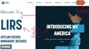
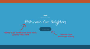
First we begin on the homepage of the LIRS website, what immediately loads without scrolling a few things catch the eye first: big contrasting words, darker colors, and a big donate button. Right away this allows us to think a few things. It leads us to our first clue of the audience, the large donate button in the bold red-orange color shows us that one of their big goals is to make money toward helping refugees, so their audience is people who will donate the money to help or will put in the time and effort to volunteer and help. This also gives us the first glimpse of their purpose, to persuade, the design choices they made to make the donate button visually stand out shows us their commitment to reach their goal through the assistance from their audience. The contrast in this above the fold view is very powerful. The dark navy blue against the bright white allows for emphasis as well as the chosen font, they begun with a thin, almost handwritten font, into a bold, thick, sans serif font. These two big contrast starts a hierarchy, the bigger text in the navy on the left and white on the right is noticed immediately, it gives you a quick glimpse on the company and their mission. The hierarchy also helps us travel the entire entire page, as we begin scrolling through we get more blues, whites, and red-orange, more bold headings, and some repetition. The organization gets into introducing themselves, their mission, and other information before repeating a donate button with a hashtag, this hashtag will connect to the social media side of today’s society. Almost everyone uses social media, and most people are addicted to it, so this will help their organization expand by getting shared to new people with something as simple as a hashtag.
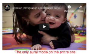
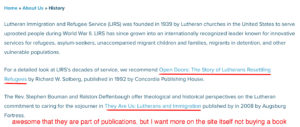
After scrolling through the entire home page we can connect that this is a nonprofit website specifically, because it follows the technique and template, a lot of large imagery, big bolded text, saturated colors, and a one column design with a grid like structure. Now that we know general idea of the site that we are on we can continue clicking through the tabs of the top navigation. The first tab is information on the organization, it goes into a mini overview and we get our first, and only, aural mode, a video of the company, their mission, and imagery to entice the viewers emotions for compassion. They also have a side menu with more tabs to get deeper into the history, mission, and the people behind the story. The history is extremely short because they lead you to two different books that help tell their story, I believe it appeals to their credibility, if they have been published in something it helps give you a sense that they have been around, they have made an impact, and others can see that and trust them. Finally, it goes into the leadership and partners where there are a lot of people listed which shows that there was a lot of people who went into this website. The Lutheran Immigration and Refugees Service is our big author, they are the organization held accountable and the focus of the entire website, but a lot of people are a part of this organization to get it where it is. A few names that seemed most important to the website specifically is the board chair, Michael Rinehart, vice chair, Linda Stoterau, interim president and CEO, Pat Nichols, director for marketing and communications, Danielle Bernard, and director of outreach, Folabi Olagbaju. A lot of people and a lot of Lutheran churches have been involved in this organization and it shows even more into their credibility and history.
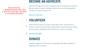
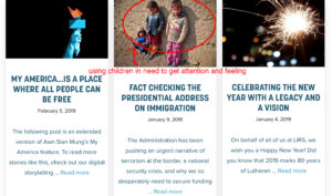
The next tab is more information about their mission, goal, and the job they do in details. This is part of the persuasion in the purpose of the website. If they show you the people they are helping with images, the details on the people they help, and they even have an entire sub tab devoted to the children to really push the viewer to feel empathy for those they are trying to help. It also shows a part of another purpose they have, to educate. They are trying to give you as much information as possible about the issue they are battling and their solutions to build into the persuasive purpose. The more informed the viewer is the more willing they usually are to help. Another tab is to inform the viewer on how they can help, donation, advocating, volunteering, and holding events. The purpose of this website is on every single tab, they again are trying to convince you to join their cause, and it is very obvious with the big, navy headings separating the page, and it repeated as sub tabs and links.
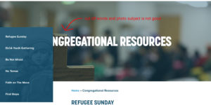
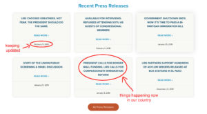
The tab with resources also has the purpose twined into it well specifically for the churches and how they can put their organization and goal into the churches congregation. I spotted a minor tweak, every tab has a header with an image, overlaid with the title of the tab, and the sub tabs as a menu on the left. For this tab it didn’t quite work out with the left menu. Putting a navigation menu on the left is important for viewers looking on a phone or tablet, which does help us know they want readers to be able to view this on any device anywhere, but for this longer title and the subject of the image being left aligned the menu covers up part of both making the three elements not work as well together. The tab also helps us analyze the audience again, this shows more into the secondary audience, the lutheran churches. The entire tab is dedicated to how they specifically can help with refugees and spreading the word allowing us to believe it is a focus for them to branch to more. They are hoping for an audience that is religious and faithful and this tab alone represents that hope. The final two tabs are articles and blogs on more information about refugees and current updates on the issue in America. This and the copyright at the bottom of the site gives us the information that LIRS keeps their information up to date which allows us to look more into their credibility in a positive way and the context of this website in the fact that it is constantly revolving to stay with the times.
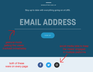
The website is very cohesive and has repetitive pieces to help with that. The navigation and footer does not change with the contrasting donate button, LIRS logo, social media buttons, and other links. They also repeat the email newsletter at the bottom of every page which helps show they are reaching out to their audience and allowing the audience to engage and feel a part of the community quickly. This is a strong gestural quality that other sites do not have. They also use the thin, handwritten text every now and then which makes it feel a bit more personable and helps those texts to stand out compared to all the bold, geometric text. They did well in a lot, but they do have some things to work on. I believe pulling in more of an aural mode with video could help push more of trying to encourage empathy from the viewers. This will also boost their gestural and visual modes allowing the website to develop more in multiple areas. Another element I would suggest would be to add more into the information on their history and the people involved. That tab seemed short and dry, instead of putting details in their history they put a publication that cost money. It looks good to be a part of a publication, but adding more history on their own site would allow people to trust them more. Also adding more of the people working for the organization, images, quotes, who they are, would make it more personable and allow the readers to gain more of a connection with the people inside then just stating names and jobs.

Looking through the entire Lutheran Immigration and Refugees Service website, their purpose is strongly shown and that was the goal in the website to persuade more people at a wider range to join in the movement. They had some weakness, for example while other refugees nonprofit sites have a tab specifically to those they are trying to help, LIRS does not have resources for them, but they had a lot of strength in their cohesiveness, visuals of contrast and imagery that pulls at the audiences emotions, and filling the site with information to educate. I believe those strengths were stronger than the weaknesses and could potentially hook the audiences into donating and volunteering to the cause. With the images of the children in need it can make you feel, with the bold donate button on every page it could persuade you to want to donate your money, and with its informative and convincing qualities maybe they can get you to join and in the end help someone in need.
Citations:
Lutheran Immigration and Refugees Service. 2019. www.lirs.org/. Accessed February 10 2019.