When viewing the LIRS website, the first thing that sticks out are the two graphics under the menu. The large text and strong contrast causes you to be drawn into their claim that all people are human and the stories they want to share. Ultimately the main purpose of this site is to raise money. There is a donate button that sits right in the main menu at the top of every page. Not only is it in the menu at the top of the page, but it is the one link that has a bright orange button which makes it stick out drastically from all of the other links in the menu. It is very clear that this is a nonprofit website because of the big donate button at the top of every page. They do deserve credit though, they did go with design more unique that some of the nonprofit websites we viewed in class.

By choosing a website the organization has created a central hub for their online presence. So much of our lives are spent online that it makes sense that the organization would want to be where their audience is and once the website is established, they can point all of their other online presence to their website. All social media, emails, and just about anything else can direct people to their website for a more complete picture of the organization and ways the audience can participate. While the use of websites is on the newer side compared to other means of publication such as print materials, they have become standard and expected for every organization. People rely on them to learn about the organization, instead of searching for brochures or people who are part of the organization they turn right to the website. Since the website is their first place to turn, people expect the website to be good. If the site navigation is not easy to use, or if they can not find the information they are looking for, the viewer will just turn away and look into a different organization with a better website.
Viewers could look at this site from their phones, but I would think that most of the views comes from either laptop or desktop computers. This site had a lot of text to read and most people don’t want to read as much on their phone as they would on their computer. Viewers who are visiting the site for the first might look around the site on their phone but I would guess that they would try to find an actual computer if they wanted to spend time reading the contents.
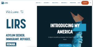
Right from the front page it is apparent that this website is aimed an audience that values viewing people as people. The site is appealing to these values right from the homepage where the one of the first thing you read is “Asylum Seeker. Immigrant. Refugee. Human.” The organization is saying how people are people and we need to help each other out. They also use images that have a lot of meaning behind them such as the image of the Statue of Liberty used in header on Missions and Vision page. Using an image like this not only is familiar to people, but the Statue of Liberty is associated with feelings of freedom, empowerment, and unity of the country. This helps the author appeal to the audience because when the viewer if reading through the website and then sees that image it is going to lead the viewer to think about the mission of the organization associated with all of those good feelings evoked by the Statue of Liberty.
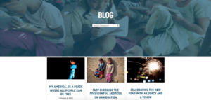
The site also brings attention to what the organization is doing, through the traditional pages like About Us and Our Work, but it also included press releases and a blog. The blog can give a more personal connection to the organization or making the website feel like it is active and not just a stationary text. This site also wants to reach asylum seekers, immigrants, and refugees and provide them with assistance. Specifically through the site, they want to help provide loans to these people. In the upper right corner of every page as well as part of the normal menu is a link to the loan portal for people applying for loans and managing the loans they have received.
Nowhere on the site does it really seem to talk about the author of the site. It can be assumed that the organization would be the ones behind the website because it is a site about them, and then in the footer of the site it indicated that LIRS holds the copyright privileges. In navigation to the page titled “Our Leadership” under the About menu, a list of the leadership team is related. It it broken down into the representation members and the staff leadership. Currently they are seeking a new President and CEO, so at the current moment they are being led by interim President and CEO Pat Nichols. Even though they are being let by Pat Nichols, I wouldn’t consider him the author of the site. I believe that the site is a representation of the organization as a whole and was comprised by a few representatives of the organization to make sure that it accurately represented the entire organization.

Overall I thought the site did a really good job at presenting information and trying to get people to take action. I do think that they could have benefited from using some video or at least something moving. Additionally something with sound. I was not able to easily find any spots where the website used any sound. One question that was raised for myself was the name of the organization. The URL, the logo, and many places on the site it refers to it as LIRS, in the footer it shows that it stands for Lutheran Immigrant and Refugee Services. LIRS seemed a little odd to be, like I wanted to know what it stood for the entire time I was looking around until I found it in the footer.